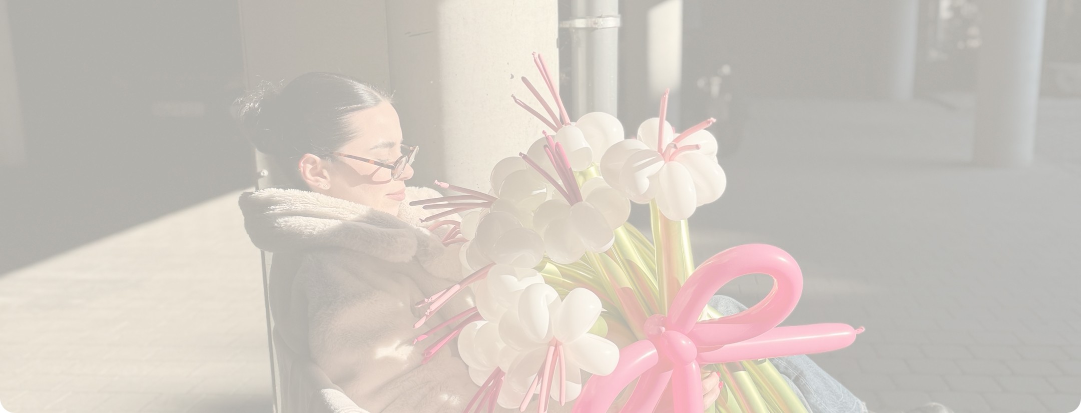

Before there was a brand, there was a feeling.
Bablooms came to Luazul at the very beginning. No brand. No name recognition. Just an idea, a name, and a feeling Auguste hadn't fully translated yet. She's building the first balloon flower business in Lithuania: gifts that hold their color and their shape long after real flowers have wilted, made for any occasion, not just the obvious ones.

What We Did
On the surface, the ask was simple: turn the idea into a launched brand. But she was specific about one thing from the start. She didn't want a store. She wanted a catalogue, something that showed the work and then guided people to order directly with her, no cart, no checkout, no distance between the gift and the person giving it.
The harder problem sat underneath. There was no visual language yet, nothing concrete to build a website on top of. And whatever we built had to protect the thing that made the idea special in the first place, a personal relationship with every order, not a transaction. The obvious move would have been a typical ecommerce template, product grid, add to cart, done. It would have solved for speed. It would have cost Bablooms its warmth.


The Solution
Built to guide, not to sell.
We started with the thinking, not the visuals. Through questionnaires, research and a series of strategy calls, we worked with Auguste to define what Bablooms actually was: its vision, its tone, its reason for existing beyond the product itself.
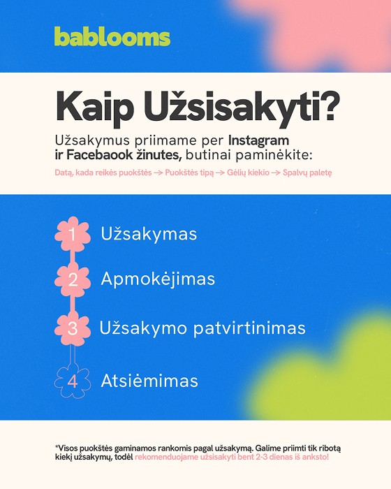
The insight that shaped everything: this wasn't a store, it was a guide. Once that clicked, every decision got easier. The visual identity took its softness and its craft from the balloon flowers themselves, rounded, playful, considered. The website became a digital catalogue, built to walk visitors through the product and toward one simple next step: ordering directly with Auguste. We closed out the launch with an initial set of social content to introduce the brand to the world it was about to enter.
Bablooms launched on schedule. Early growth held steady through active promotion, and the feedback that mattered most wasn't about the flowers, it was about the site: visitors knew exactly how to order, right away. Bablooms hasn't stopped growing since.


Component Spotlights
Logo Typography. Rounded sans serif, because balloons don't really do sharp corners. It's the kind of playful that still knows how to behave itself, friendly enough to invite you in, tidy enough to be taken seriously.
Colour Palette. Skips the expected floral pastels entirely. Cherry red carries most of the weight, backed by warm, saturated tones pulled straight from the balloons themselves. It reads as a gift, not a garden centre.


Home
Pricing
About Us
Blogs
Get In Touch
Luazul Ltd.
+447383111505
hello@luazul.co.uk