Visual identity
Visual identity
E-commerce website design & build
E-commerce website design & build
Product & marketing photography
Product & marketing photography
Catalogue
Catalogue
Flyer
Flyer
Exitooth arrived with a clear business plan and no identity yet: selling tooth extraction tools directly to dentists, dental clinics, and dental schools, with a store that needed to be ready to sell from day one. But the dental tools market runs on trust, and trust in this category usually means the same visual shorthand everywhere you look: sterile whites, clip-art teeth, forgettable type. Play it safe and Exitooth disappears onto the shelf next to everyone else. Push too hard and dentists stop trusting the brand before they've even checked the specs. The real ask wasn't a logo. It was permission to look different in an industry built on looking the same.

Sub-heading
Sub-heading
Space Grotesk Regular
Space Grotesk Regular
Look no further
Look no further
Headline
Headline
Space Grotesk Bold
Space Grotesk Bold
The perfect blend
of price & quality
The perfect blend
of price & quality
Body
Body
Space Grotesk Regular
Space Grotesk Regular
Get professional-grade tools without the inflated price tag. Every instrument is carefully selected to deliver top-tier performance at a cost that makes sense for working professionals.
Get professional-grade tools without the inflated price tag. Every instrument is carefully selected to deliver top-tier performance at a cost that makes sense for working professionals.
Buttons
Buttons
Space Grotesk Bold
Space Grotesk Bold
Get in touch
Get in touch
The Solution
The Solution
The name already knew the way out.
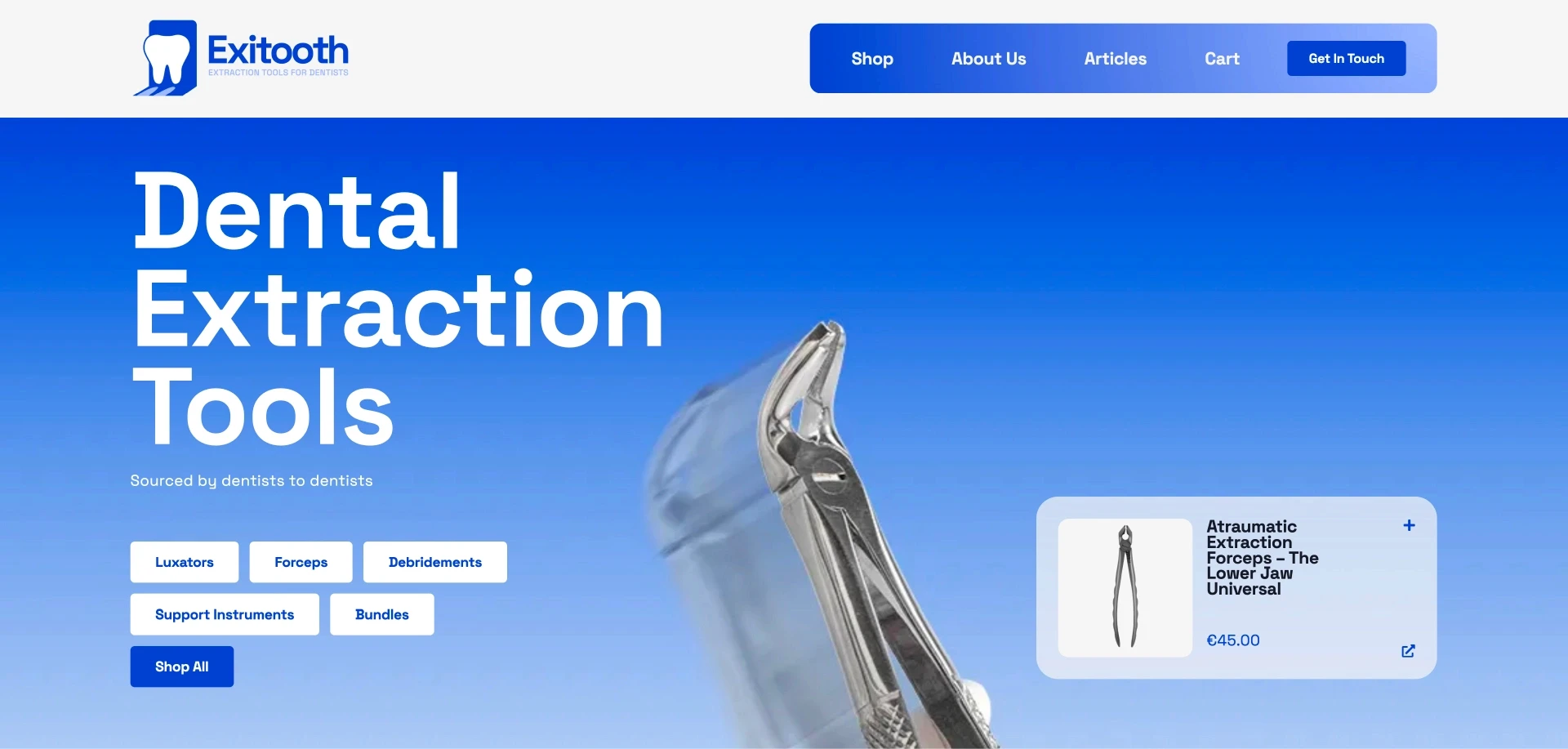
The word "exit" was sitting right inside "Exitooth." Once we saw it, the mark designed itself: a tooth walking out through an exit door, a shape that reads instantly and never needs the anatomy spelled out. It gave the brand something rare in this category, a mark with a sense of humour that doesn't undercut its credibility. From there the identity built out clean and considered: a controlled palette, confident type, and a photography approach split to do two different jobs, straightforward studio shots for fast, easy browsing on the store, and brand forward editorial shots for marketing, so the brand has room to show personality without slowing down the buying decision. On the site, the interactive tooth map, select the tooth, find the tool, became the front door to the whole store, turning what could have been a plain product grid into the fastest way a busy dental professional finds exactly what they need. Exitooth launched with a full identity, a working store, and a matching set of photography and print assets, ready to sell and market from day one.
The name already knew the way out.
The word "exit" was sitting right inside "Exitooth." Once we saw it, the mark designed itself: a tooth walking out through an exit door, a shape that reads instantly and never needs the anatomy spelled out. It gave the brand something rare in this category, a mark with a sense of humour that doesn't undercut its credibility. From there the identity built out clean and considered: a controlled palette, confident type, and a photography approach split to do two different jobs, straightforward studio shots for fast, easy browsing on the store, and brand forward editorial shots for marketing, so the brand has room to show personality without slowing down the buying decision. On the site, the interactive tooth map, select the tooth, find the tool, became the front door to the whole store, turning what could have been a plain product grid into the fastest way a busy dental professional finds exactly what they need. Exitooth launched with a full identity, a working store, and a matching set of photography and print assets, ready to sell and market from day one.
Component Spotlights
Component Spotlights
The Tooth Map
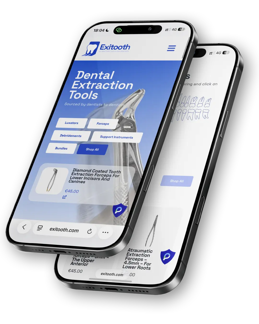
Instead of a product grid, we built a way in: click the tooth that needs to come out, get exactly the tools for that job. It turns "browse forty extraction tools" into "find the one you need in one click," which matters more when the person shopping has six patients booked before lunch.
The Tooth Map
Instead of a product grid, we built a way in: click the tooth that needs to come out, get exactly the tools for that job. It turns "browse forty extraction tools" into "find the one you need in one click," which matters more when the person shopping has six patients booked before lunch.


Component Spotlights
Component Spotlights
The Photography
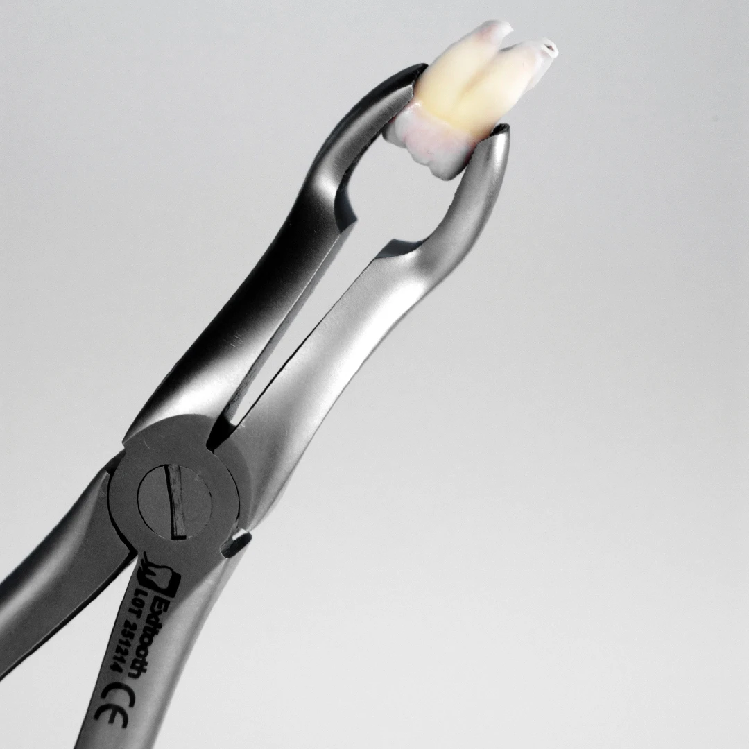
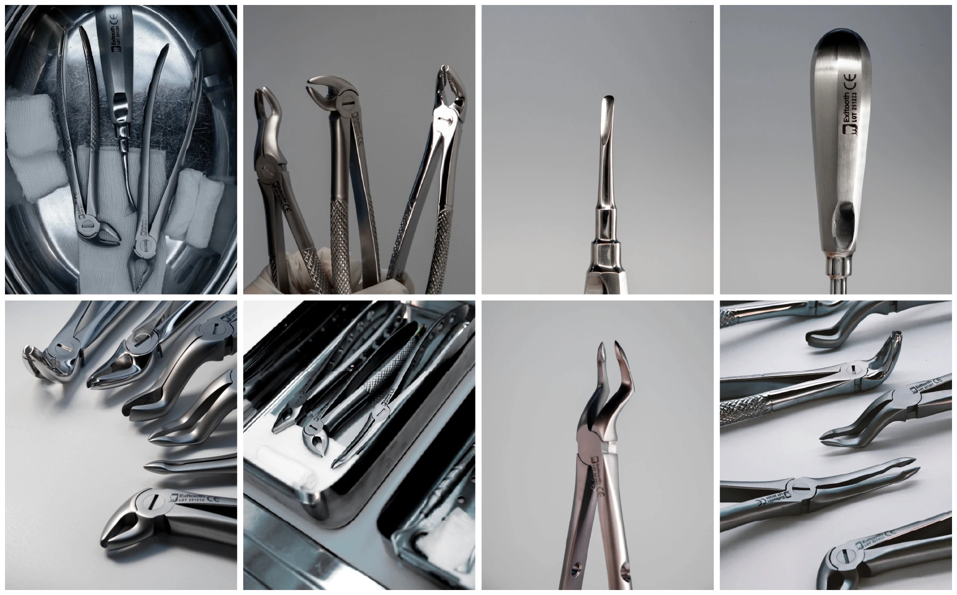
Two kinds of shots, two different jobs. The store needed clean, consistent product photography so a dentist comparing forty tools can move through the range quickly, no distraction, no guesswork. The catalogue and marketing needed something else: room for the brand to show up as more than a product spec. So alongside the studio set, we built a styled shoot, tighter framing, considered lighting, treating the tools with the same care a premium kit brand would. Same products, same brand, but each photo doing the one job it's actually there for.
The Photography
Two kinds of shots, two different jobs. The store needed clean, consistent product photography so a dentist comparing forty tools can move through the range quickly, no distraction, no guesswork. The catalogue and marketing needed something else: room for the brand to show up as more than a product spec. So alongside the studio set, we built a styled shoot, tighter framing, considered lighting, treating the tools with the same care a premium kit brand would. Same products, same brand, but each photo doing the one job it's actually there for.
Don’t get lost in the clouds
Don’t get lost
in the clouds
Home
Pricing
About Us
Blogs
Get In Touch
Luazul Ltd.
+447383111505
hello@luazul.co.uk
15 Radcliffe Road, Raf Lakenheath, Brandon, England, IP27 9RH
15 Radcliffe Road, Raf Lakenheath,
Brandon, England, IP27 9RH