
Telepatia is a high heels dance team built on movement, spirituality, and self-empowerment, offering classes and workshops across every skill level. They came to Luazul already knowing exactly who they were, a philosophy fully formed around confidence, manifestation, and owning your body, but none of it was visible yet. No brand mark, no color language, no way to carry that world onto a screen. The ask on the surface was a visual identity. The real work was translating something felt into something seen, without falling into either of the category's obvious traps: the loud, performative dance-brand look, or the soft, heavy-handed language of a self-help account. Starting from zero meant the brand had to be defined before a single visual decision got made, and that definition needed to do double duty, distinguishing Telepatia's three skill-level teams from one another while keeping them unmistakably one brand.

The Solution
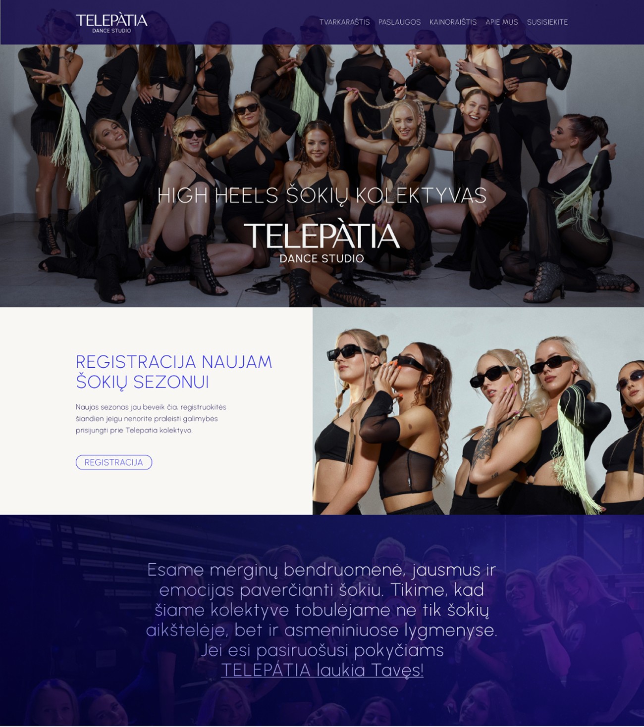
The insight that shaped everything: control reads louder than spectacle. A dancer in complete command of her body doesn't need her brand shouting to prove it. So the identity was built around restraint. The mark is a single stylized T, simple enough to carry the brand's entire concept in one form. The palette pulled from the night sky, deep indigo and violet, color that feels expansive rather than decorative, then split into a color architecture giving each skill-level team its own identity inside the same world. Typography stayed disciplined at its core, then let just enough movement in where the brand needed to breathe. The website carried that same balance into a full experience, class schedules, performances, and competitions organized with clarity, while the emotional register of the brand never got lost under the practical information. Telepatia launched with an identity that reads exactly as it should: grace, power, and intention, carried quietly rather than announced.


Component Spotlights
The T mark. One letter, stylized until it carries the whole brand's concept in silhouette alone. It doesn't compete with the color system or the photography, it just holds its shape, which is exactly the kind of confidence this identity is built to communicate.


Home
Pricing
About Us
Blogs
Get In Touch
Luazul Ltd.
+447383111505
hello@luazul.co.uk